Fencing Frenzy – Identity Design
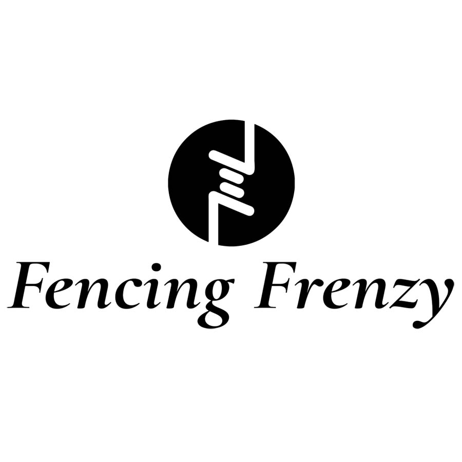
The Client wanted a simple logo that included barbed wire to represent one of the primary functions of the business. The use of two colours allowed us to create contrast, and the simplistic barbed wire creates two ‘F’s within the black circle for the company name. Similar to the Yin/Yang symbol.
Logo design created: 2019

